
The Problem:
Starting and maintaining a habit of exercising can be a daunting task for beginners. With so many different workout styles available, it can sometimes take a substantial amount of research and trial and error to find a routine that works for someone's specific body type. Another important factor to consider is time. Ideally people should try to block a consistent amount of time out of their schedules to workout. However, life happens sometimes and people may have days where they can only commit 5 or 10 minutes to getting exercise.
The Solution:
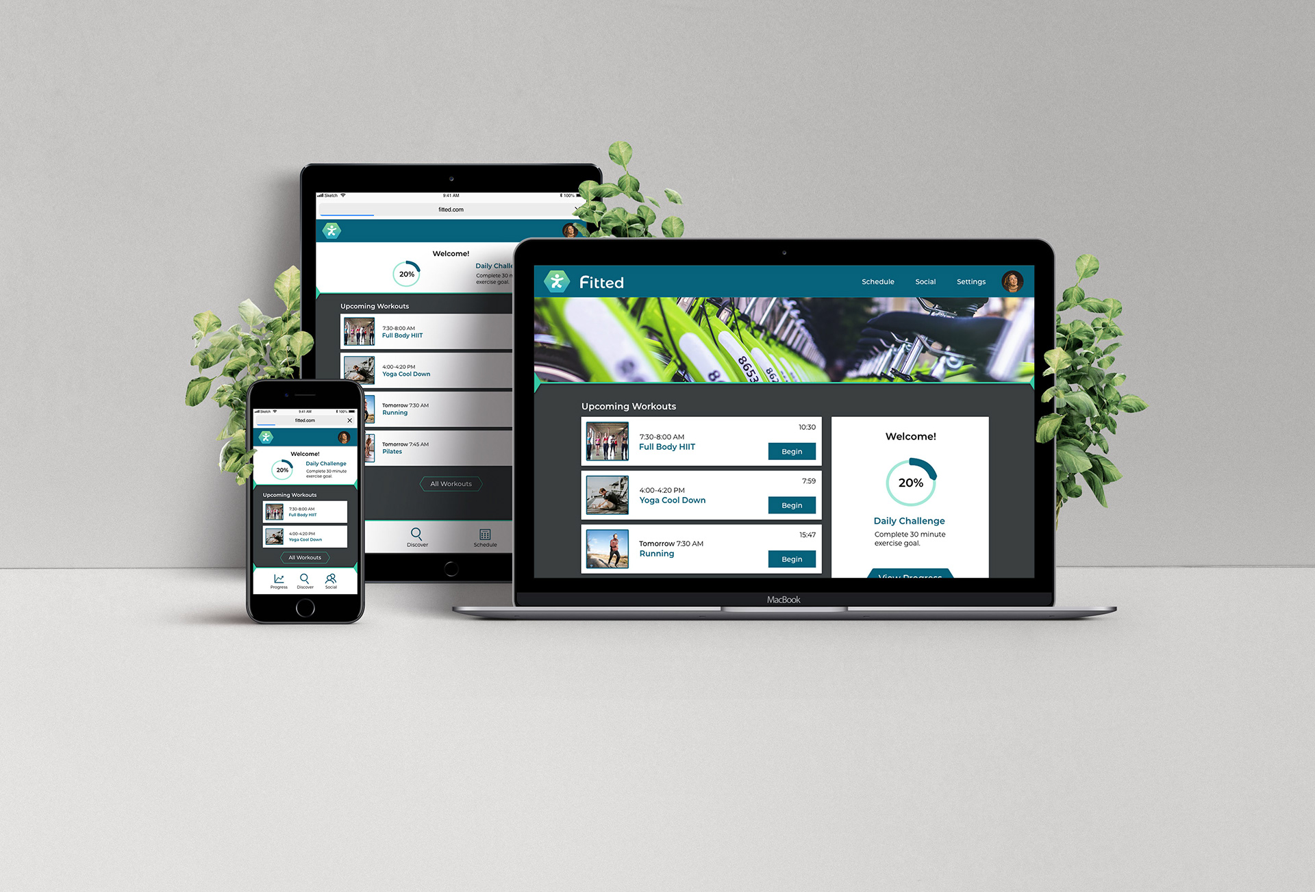
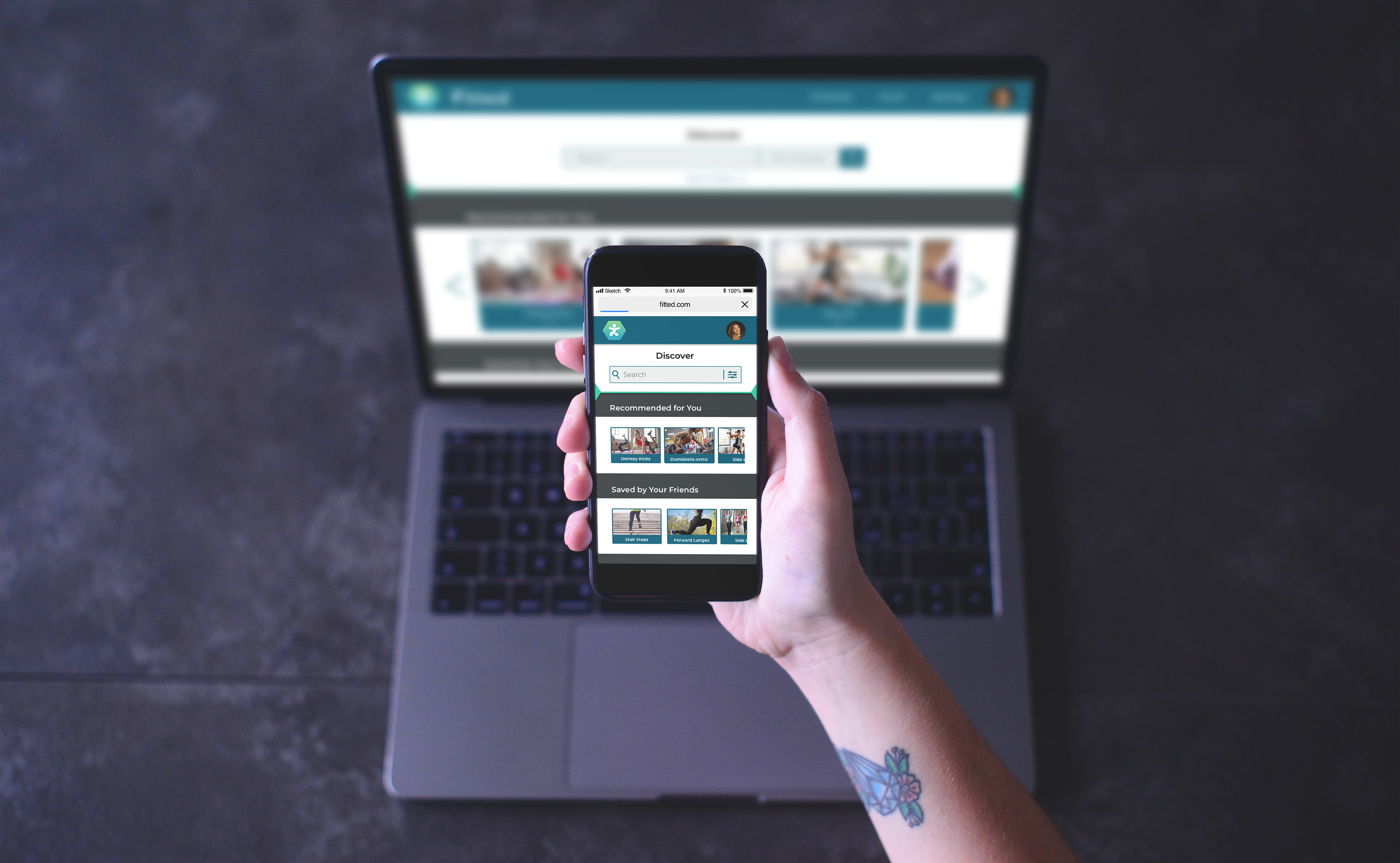
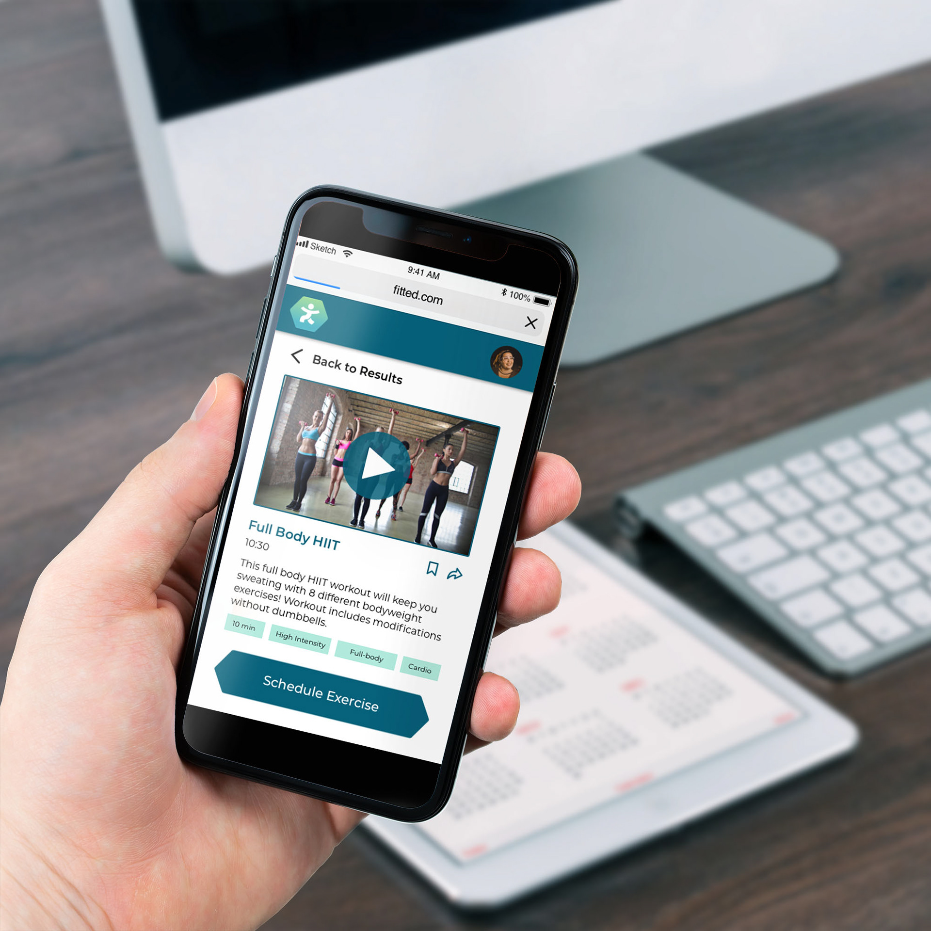
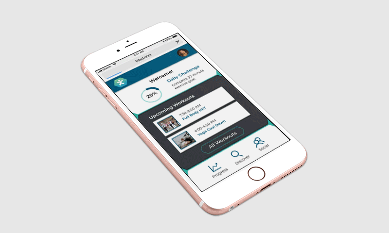
The Fitted responsive web app aims to help people quickly find workouts suited to their fitness level and body type. It helps users make an achievable workout plan that can adapt to their daily schedules. The app incorporates daily challenges and gamified achievements to encourage users toward achieving a healthier lifestyle.
Role:
UI Designer
Tools:
Sketch
Photoshop
Illustrator
InDesign
Principle
Invision
The Approach
Conceptualization:
For this project, a brief and persona was already provided. Using this information I determined the core tasks of Fitted by grouping together similar user stories. Next, I jumped directly into creating user flows that addressed each core task.
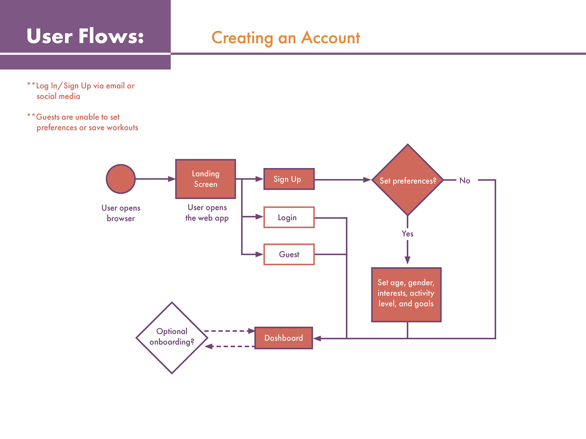
Creating an Account
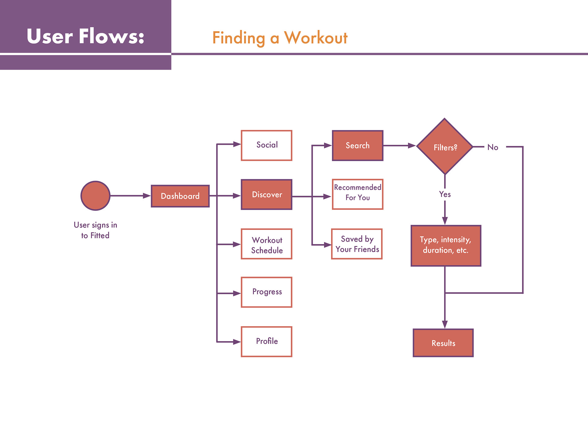
Finding a Workout
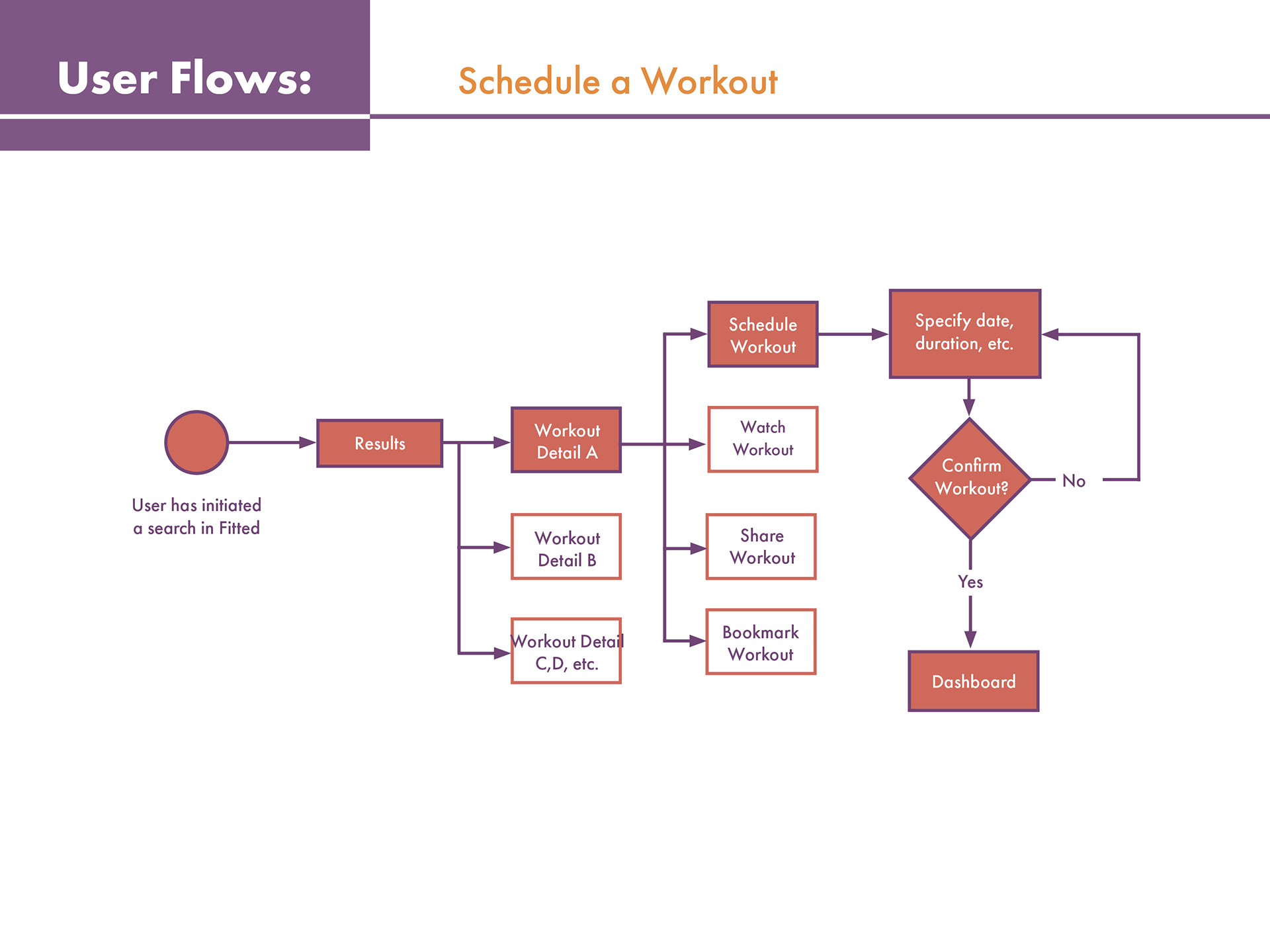
Schedule a Workout
Iteration:
The structure of Fitted began with low-fidelity wireframes sketched out on pencil and paper. Before transferring the designs to a digital format, it was important to establish a responsive grid system to help maintain a consistent look across mobile, tablet, and desktop screens. After choosing a 12 column grid system the mid-fidelity wireframes started to take shape. Additional screens were also added during this phase.
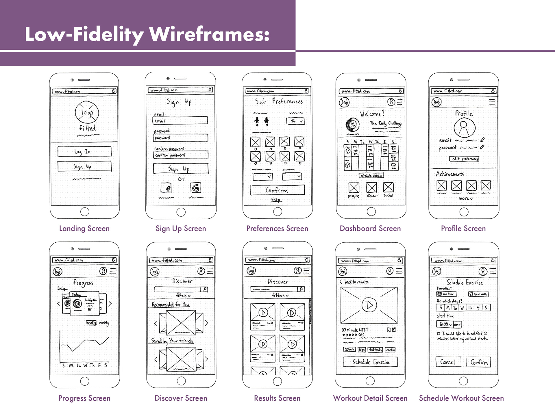
Low-Fidelity Wireframes
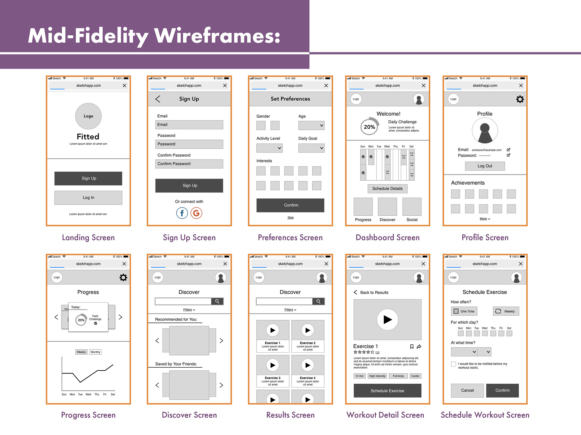
Mid-Fidelity Wireframes
With a foundation for Fitted established, it was time to work on the styling of the app. I started by creating mood boards for inspiration on what colors, fonts, and imagery would suit the app. I decided to move forward with my second mood board because I felt it did a better job conveying energy and motivation while still remaining approachable.
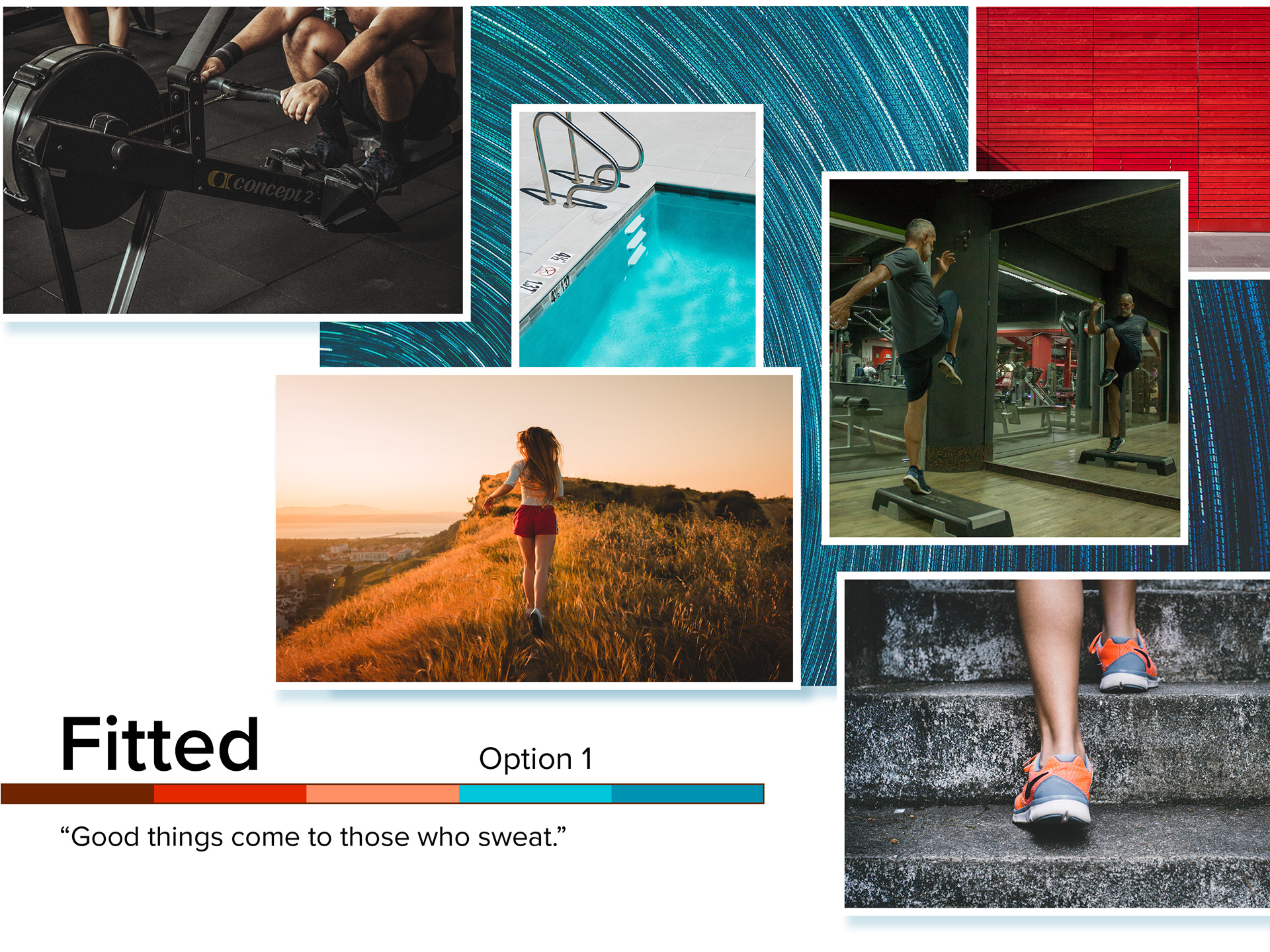
Moodboard 1
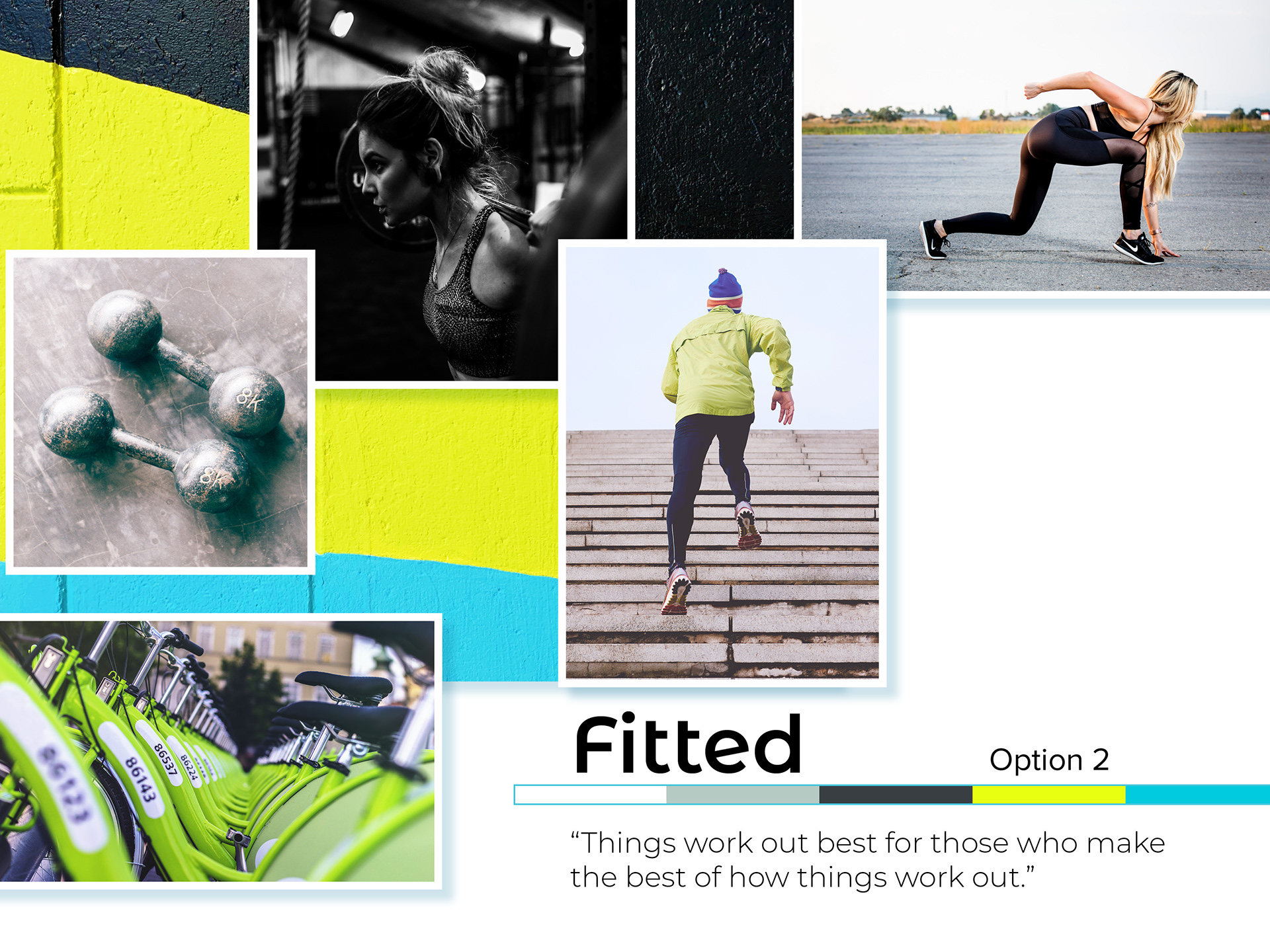
Moodboard 2
Once color and typography was applied to the wireframes, structural and aesthetic adjustments were made as needed. The overall UI styling of Fitted was then compiled into a style guide.
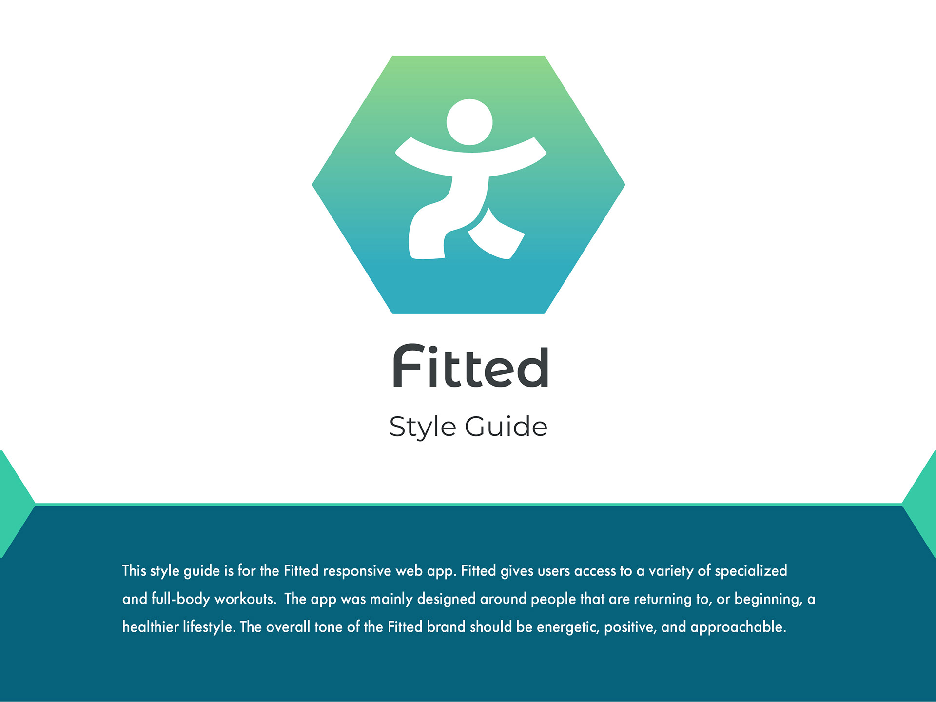
Introduction
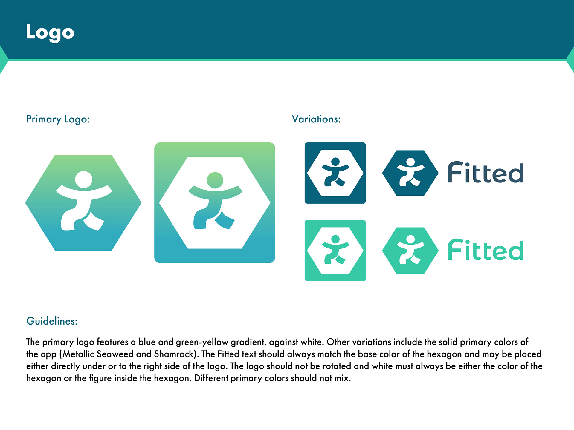
Logo
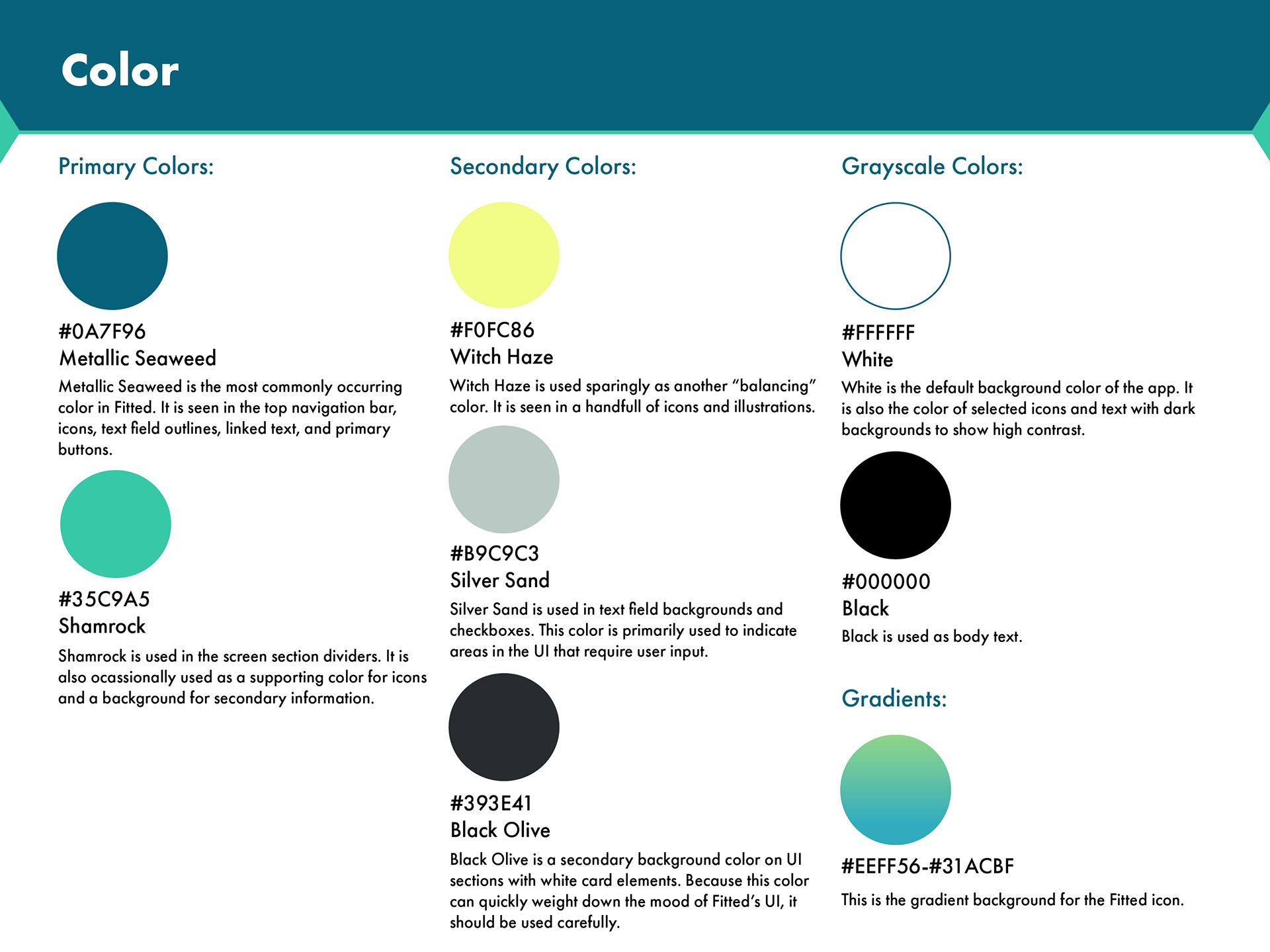
Color
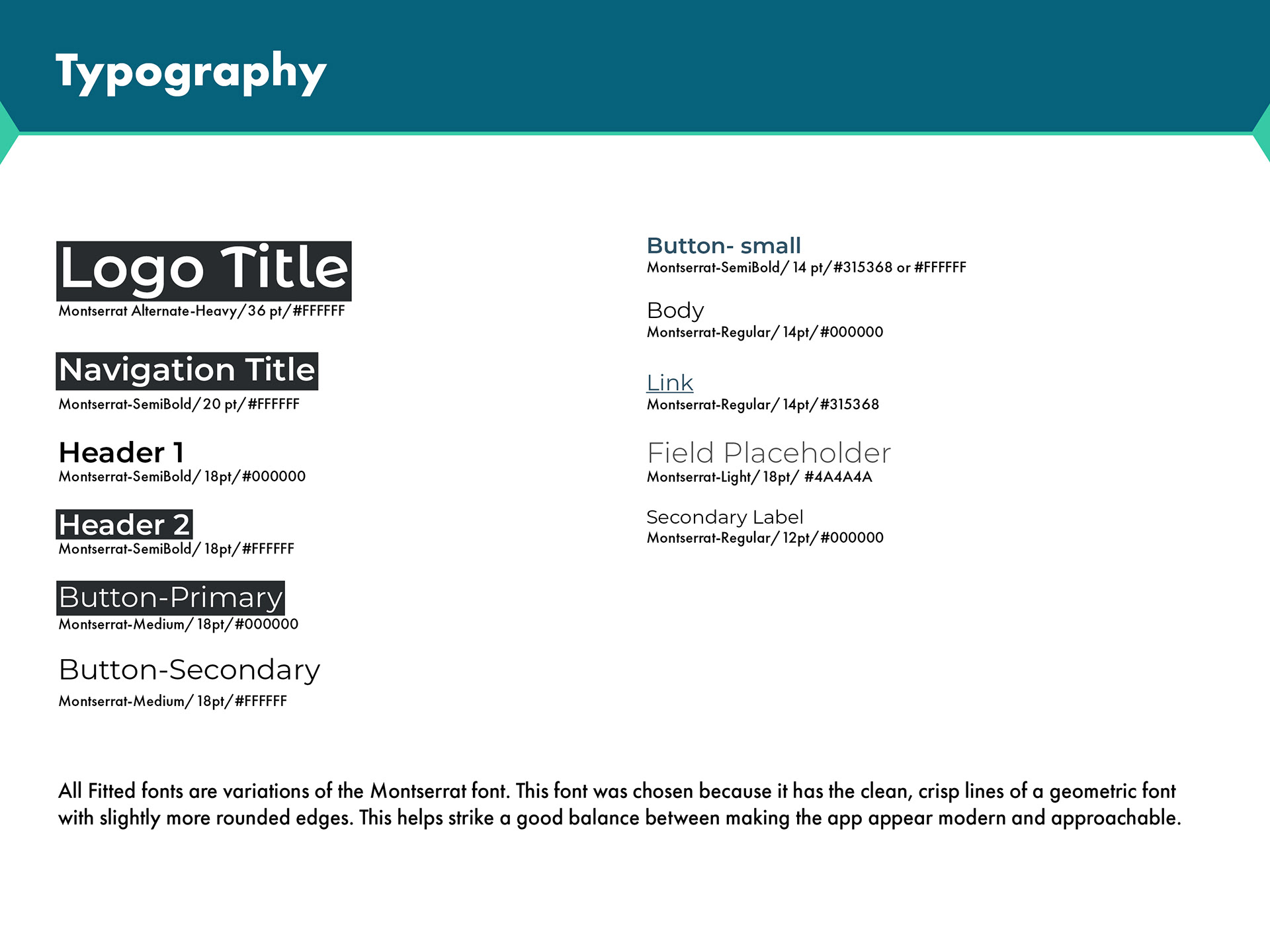
Typography
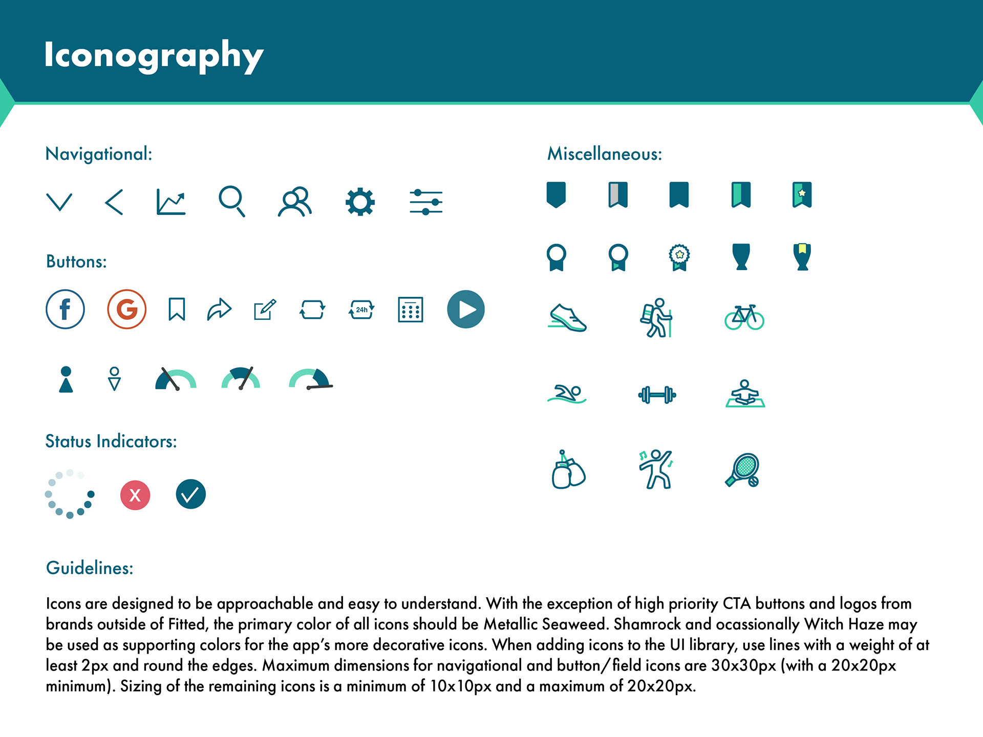
Iconography
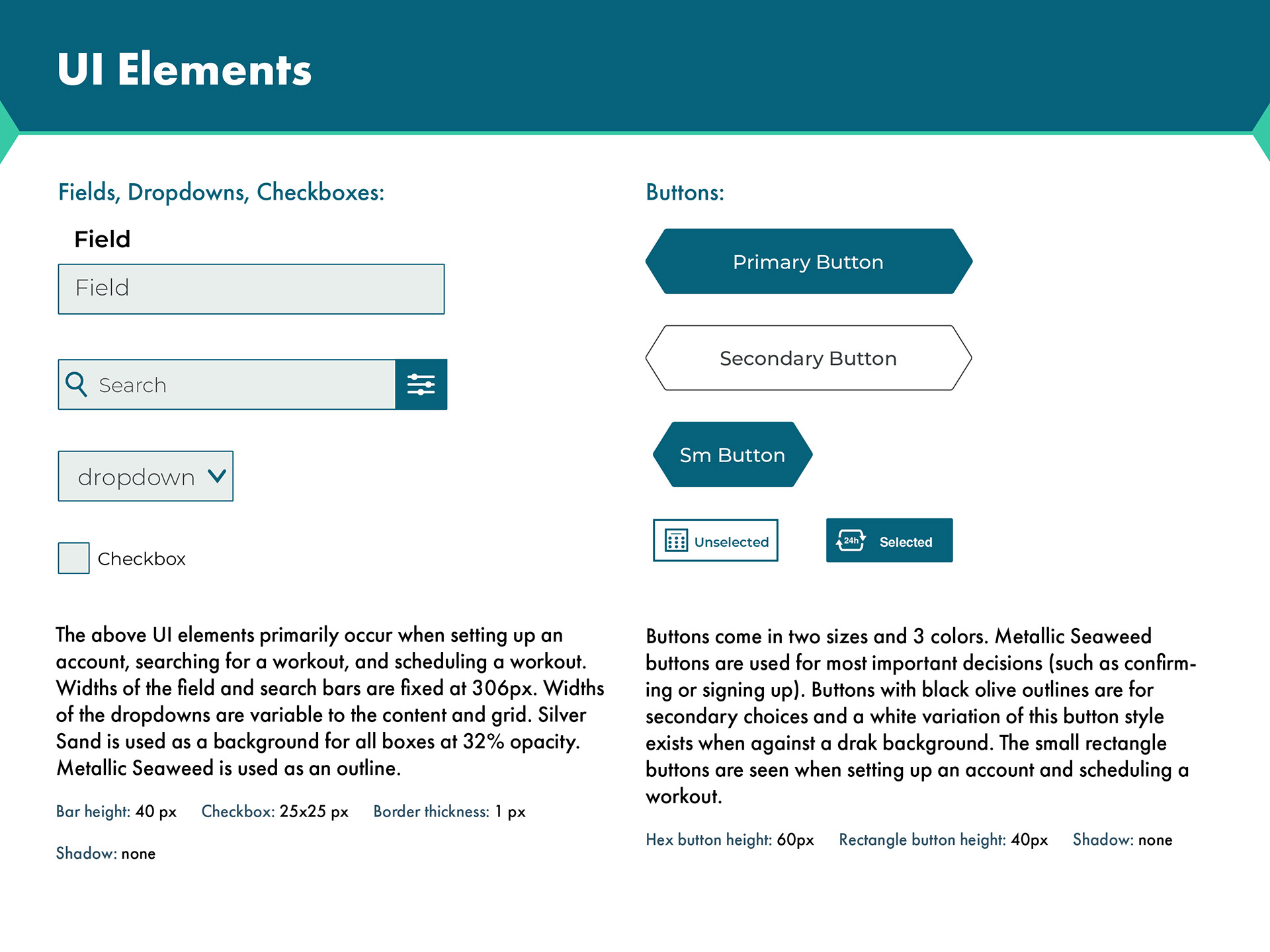
UI Elements 1
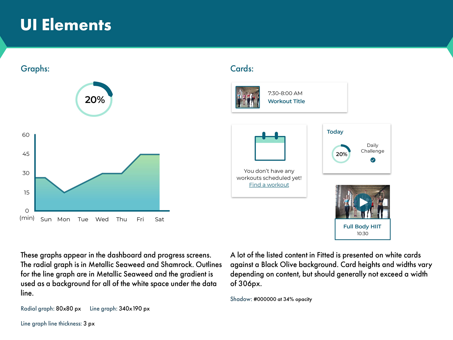
UI Elements 2
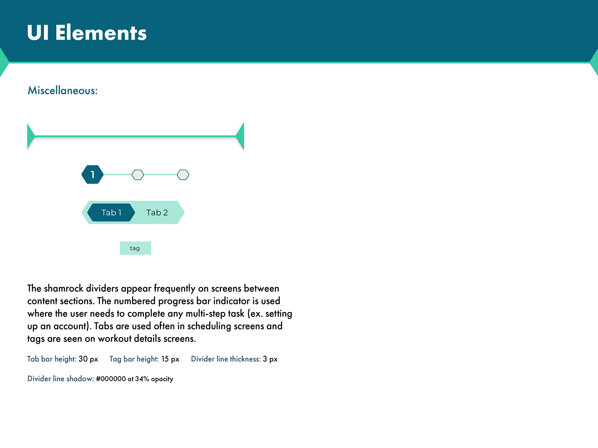
UI Elements 3
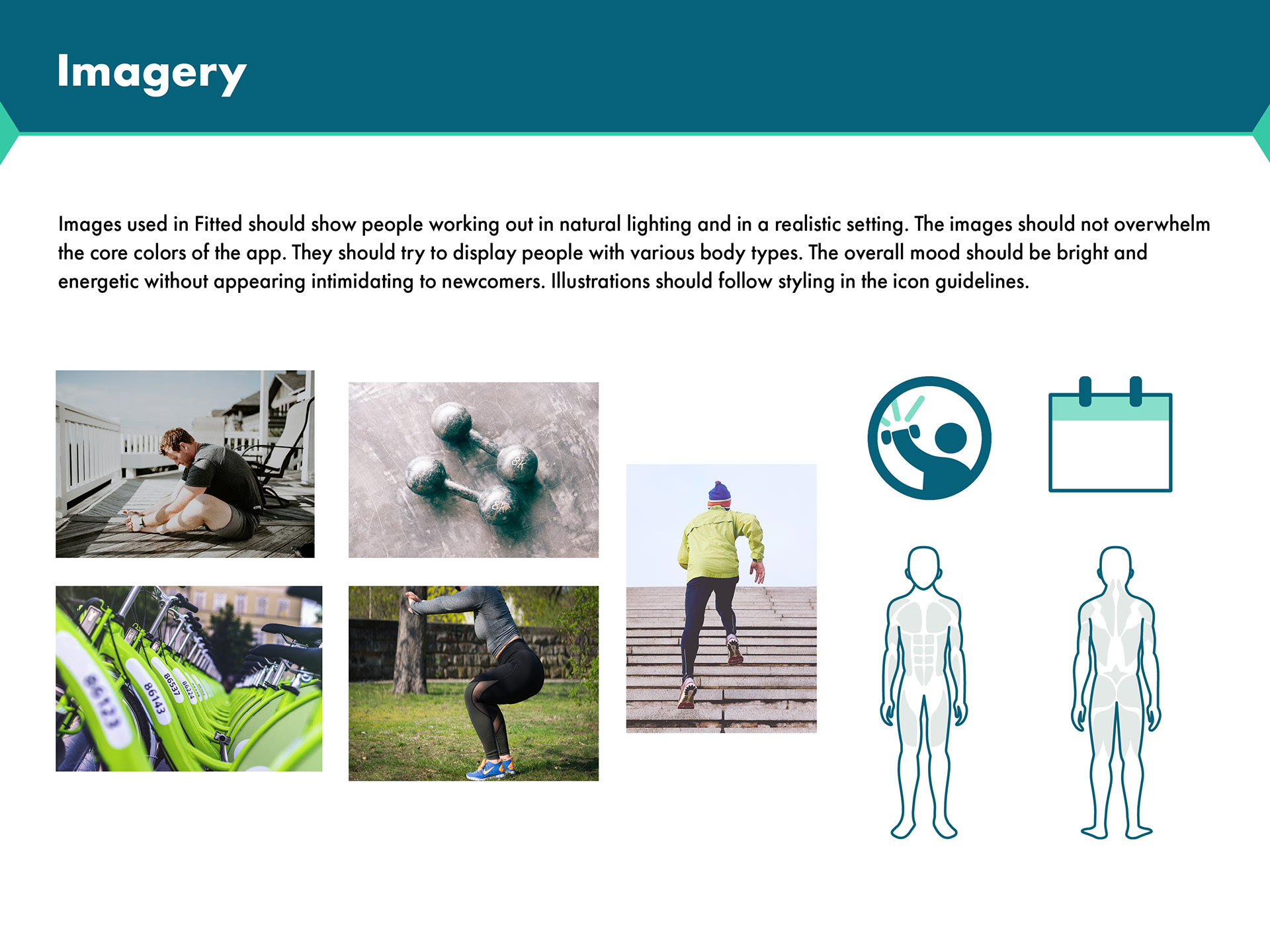
Imagery
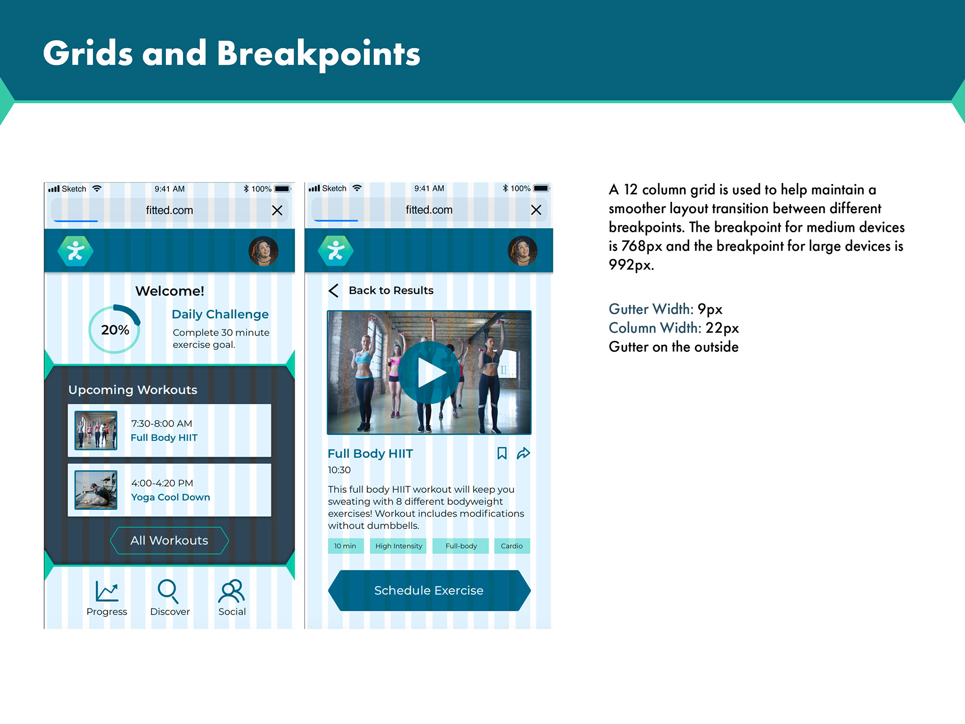
Grids and Breakpoints
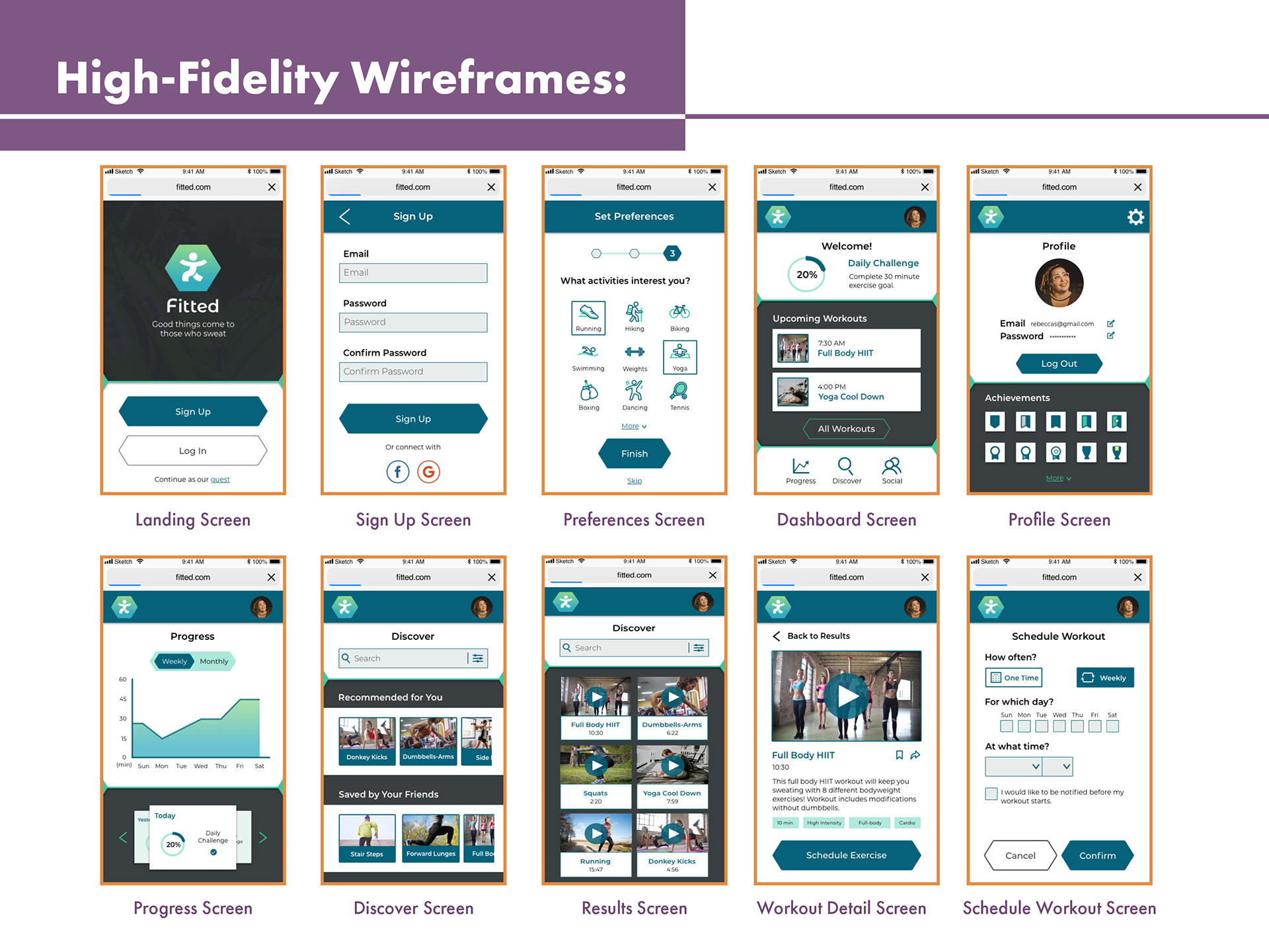
After receiving feedback from design peers and users within Fitted’s target audience, I now had everything I needed to put together high-fidelity wireframes and mockup screens. Because I used a mobile-first design approach, I waited until the mobile screens were finalized to rework the design for my two larger breakpoint screens. Special care was taken to make each screen appear clear, concise, and in line with Fitted’s branding.
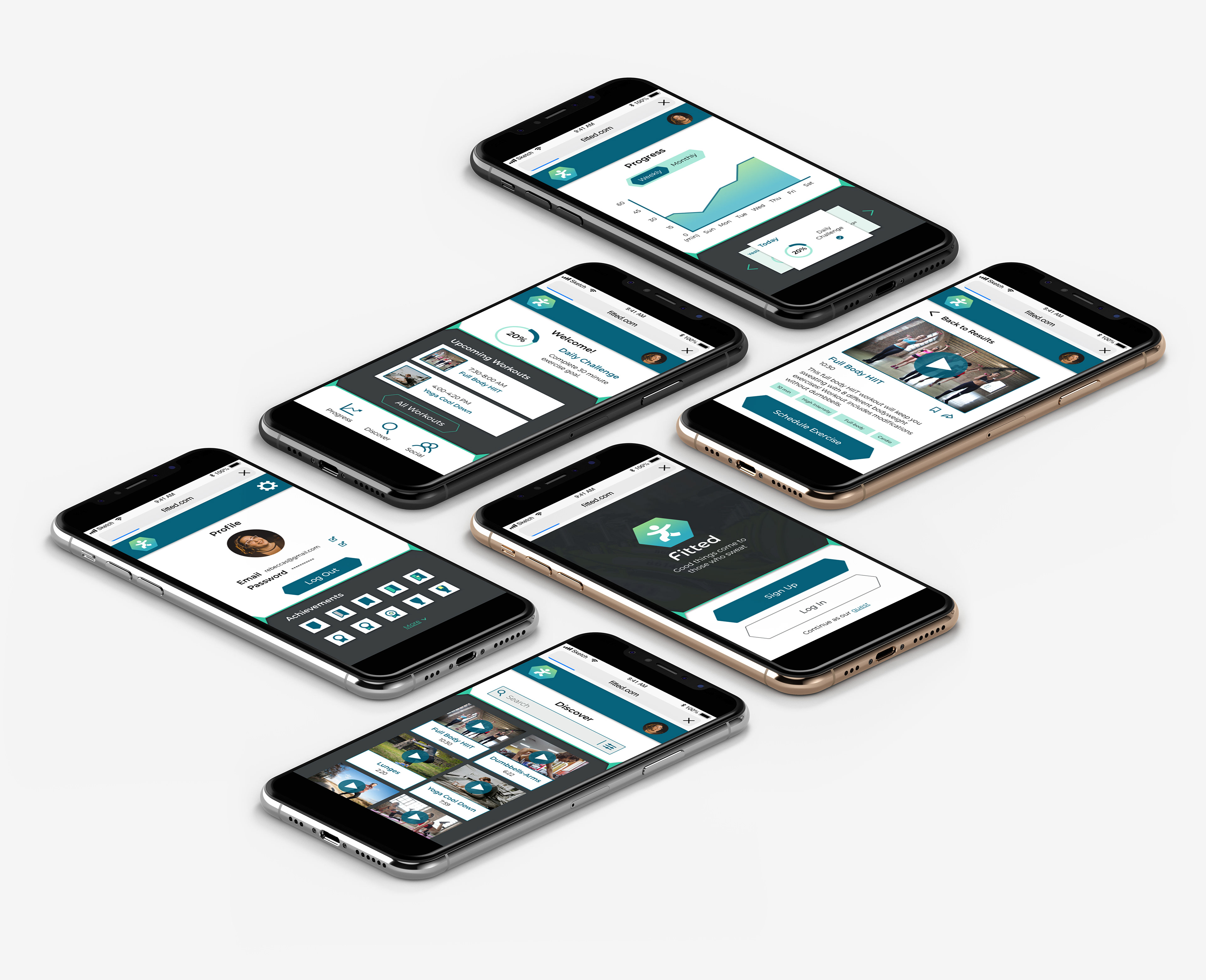
In the final stages of the project, mockup screens were placed in a prototype and animations to show gesture mapping began. I made a point to use only simple gestures such as tapping, swiping, and scrolling to help with the app’s learnability. Take a look at the finalized UI in the link below!
Takeaways
What went well:
1. Due to extra time taken to build up an asset library and in-depth knowledge of design software, the first prototype for Fitted was completed much more efficiently when compared to previous projects.
2. More opportunities were taken to incorporate unique illustrations, which contributed to giving Fitted a unified style.
3.There was time left the deadline to experiment more with advanced prototype animation. I found that this was an enjoyable aspect of the project and am now excited to use this more in the future!
What can be improved:
Certain screens in this project (such as the dashboard) had dramatic transformations by the time the final UI was completed. This was partially because in the beginning I was too focused making things look visually interesting. A fair chunk of time was spent trying to make my initial layout ideas work when, in reality, it could never be as functional as something far simpler. In short, I was reminded not to discount simplicity and to become more willing to discard ideas that don't work well.