
Overview
Tablelog is one of the leading online restaurant databases in Japan. Similar to America’s Yelp, Tabelog
allows you to locate and filter restaurants by proximity, genre, ratings, and price range. It is also a
popular method of making online reservations. Despite being a user-driven database, Tabelog has steadily
developed a reputation for being meticulously detailed and trustworthy.
allows you to locate and filter restaurants by proximity, genre, ratings, and price range. It is also a
popular method of making online reservations. Despite being a user-driven database, Tabelog has steadily
developed a reputation for being meticulously detailed and trustworthy.
The Problem:
In 2015, Tabelog launched the English-language version of their website. However, when compared to the Japanese-language website, the English version is slightly watered-down and clunky. Tabelog also lacks an English-language version of their app.
The Solution:
This redesign project aims to streamline and revitalize Tabelog’s English website. It will also make Tabelog a more responsive web app that supports tablet and mobile screen sizes.
Role:
UI Designer
Tools:
Photoshop
Illustrator
InDesign
The Approach
Observations and Insights:
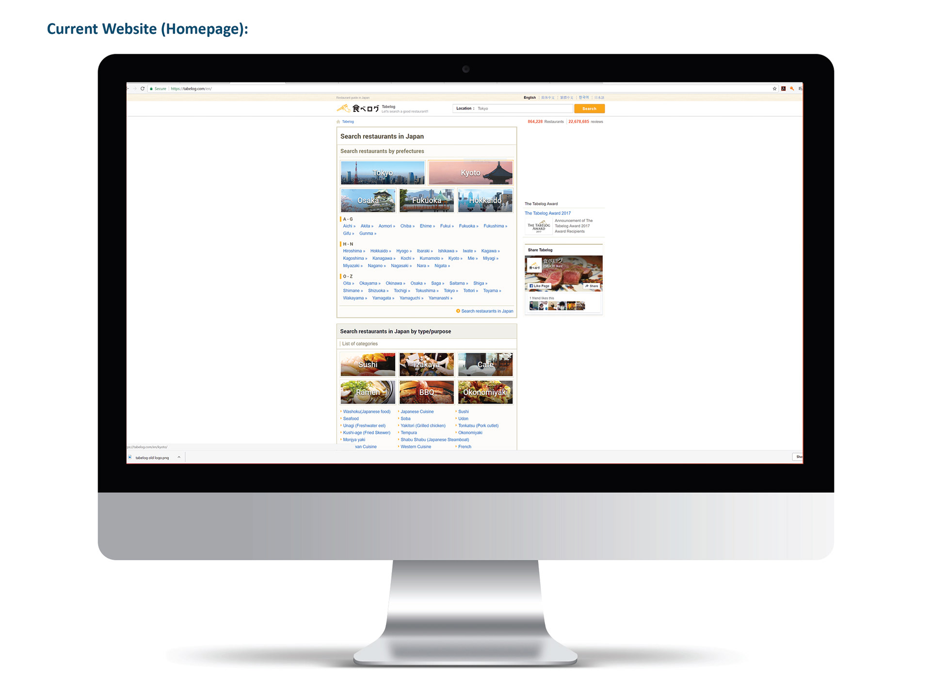
Homepage
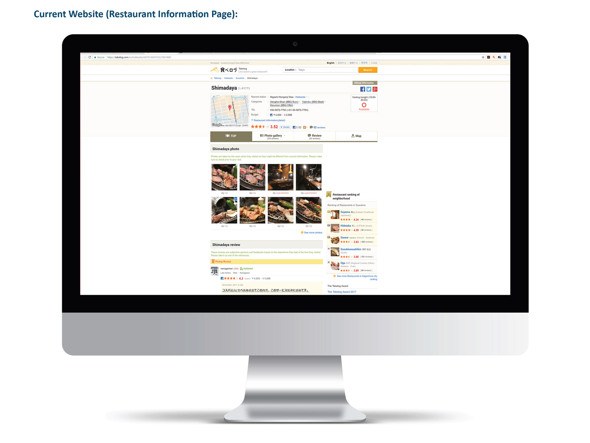
Restaurant Information Page
In addition to creating screens for tablet and mobile breakpoints, there were 4 main design problems that I wanted to address:
1. The romanization of "Tabelog" is small and feels disconnected from the logo.
2. The web pages overall lack a clear sense of visual hierarchy due to a flat color palette and inconsistent text sizing. As a result, users may be unsure of where to click first.
3. The Japanese website allows you to search for restaurants by multiple filters (such as location, number of people, time, day, etc.) in a single search bar that is easily spotted in the center of the home page. For the English website, the search bar is much smaller and located off to the side. It is only possible to search by location. The user has to search by location first and then navigate to a separate page to apply more specific filters.
4. The website has no feature that curates home page content for the user based on their current location.
Iteration:
When updating the logo, my primary aim was to integrate the romanization of "Tabelog" with the styling of its original typography. Mach Pro was chosen as the logo typeface to match with the sharp, boxy angles of the kanji characters. In the interest of saving space, I made an abstracted image of chopsticks and used it as a divider between the kanji and romanized characters. I did not want color usage of the logo and website design to deviate far from its original source; however, I did expand the color palette with off-shades of blues and yellows.
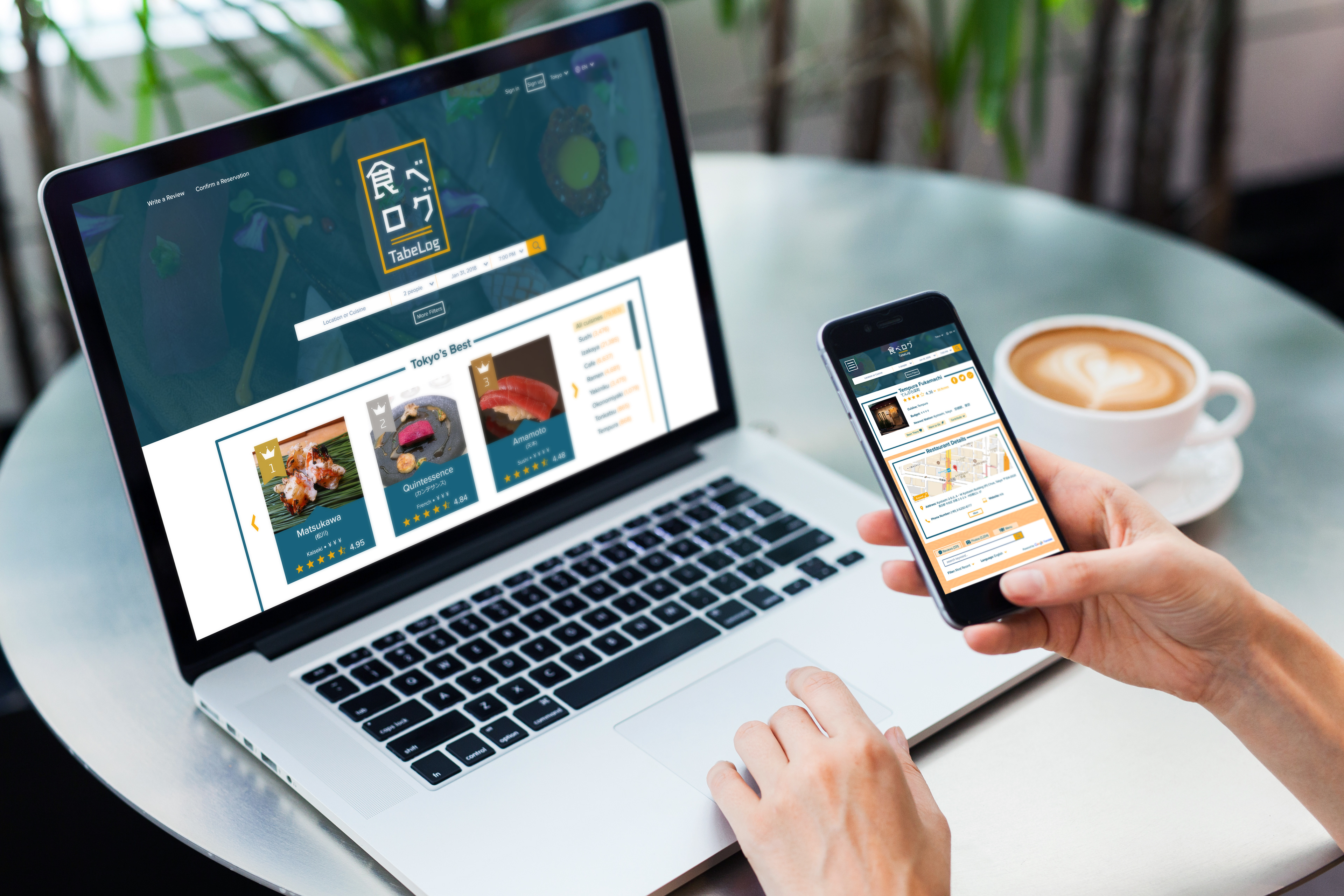
When piecing together the website layouts, my goal was to achieve a modern and straight-forward design. In both the homepage and the restaurant information page, key elements were condensed and reorganized. Like the Japanese website, I modified the search bar to find restaurants by a wider range of filters than simply location. I also gave Tabelog’s ranking system a more prevalent presence in the English website because it is one of their staple features.
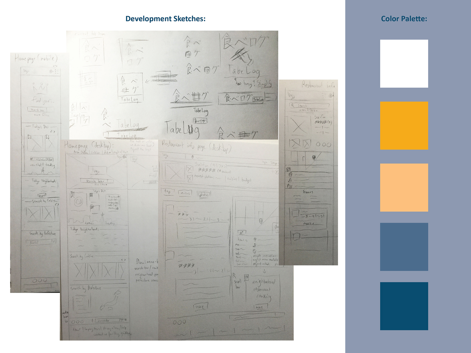
Sketches and Color Palette
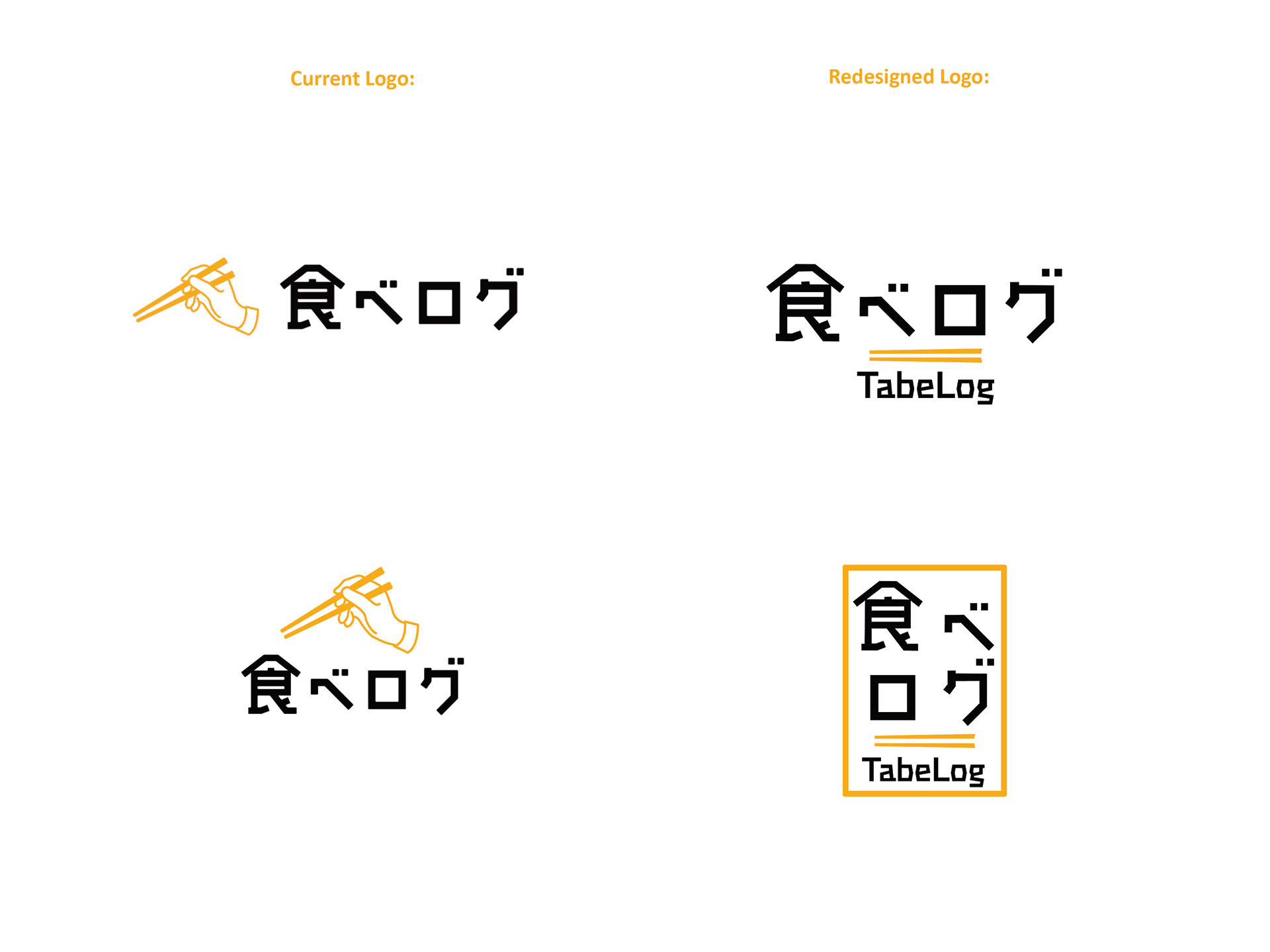
Logo
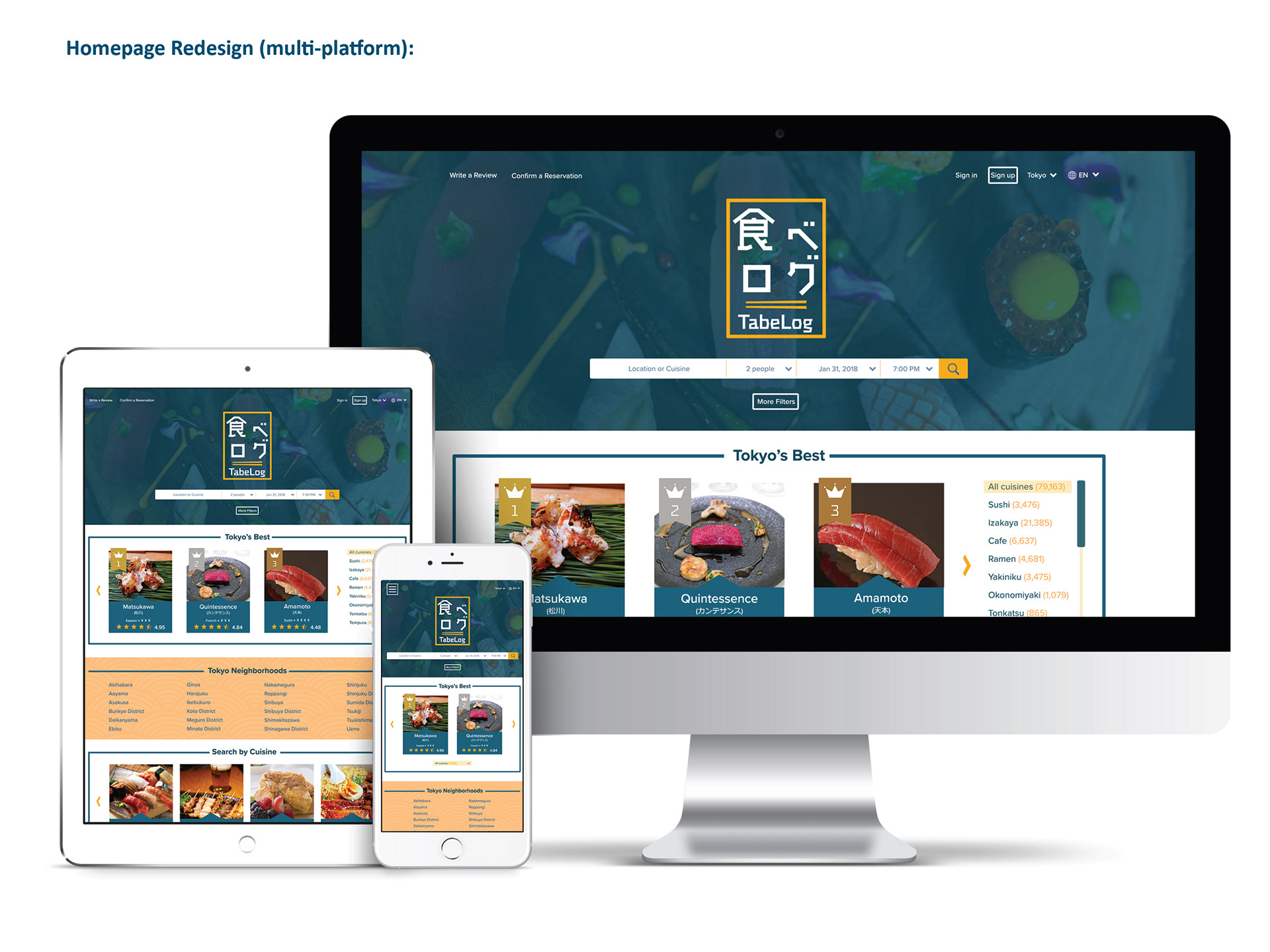
Homepage Redesign
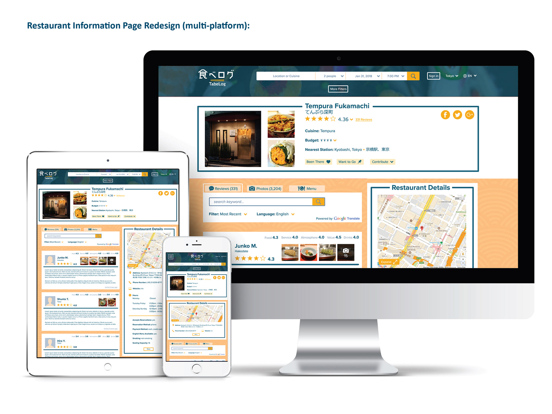
Restaurant Information Page Redesign
Takeaways
What went well:
1. The functionality of the English-language website better matches the Japanese website.
2. The website is now more responsive and could easily be adapted into an app.
3. The website overall does a better job at following accessibility guidelines.
What can be improved:
Although this was not intended, too many liberties may have been taken with Tabelog's color scheme (compared to their Japanese website). If the project were to be revisited, this would fortunately be a relatively easy problem to fix. Although the Tabelog redesign started out as a more experimental project, going forward it would be good to adapt these screens into a clickable prototype and see how it is received by a mixture of English and Japanese users.